Ragged Edge
Visual Identity
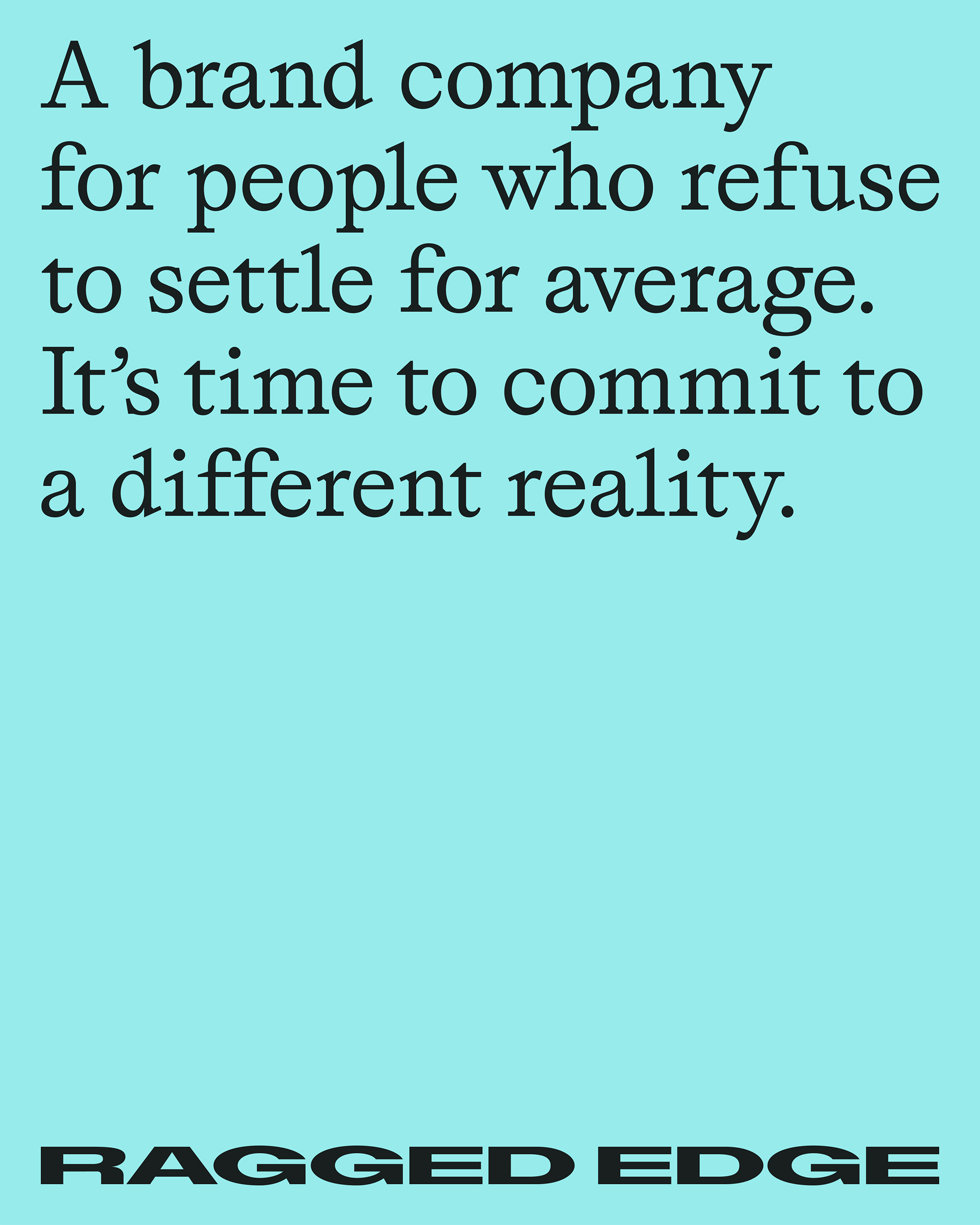
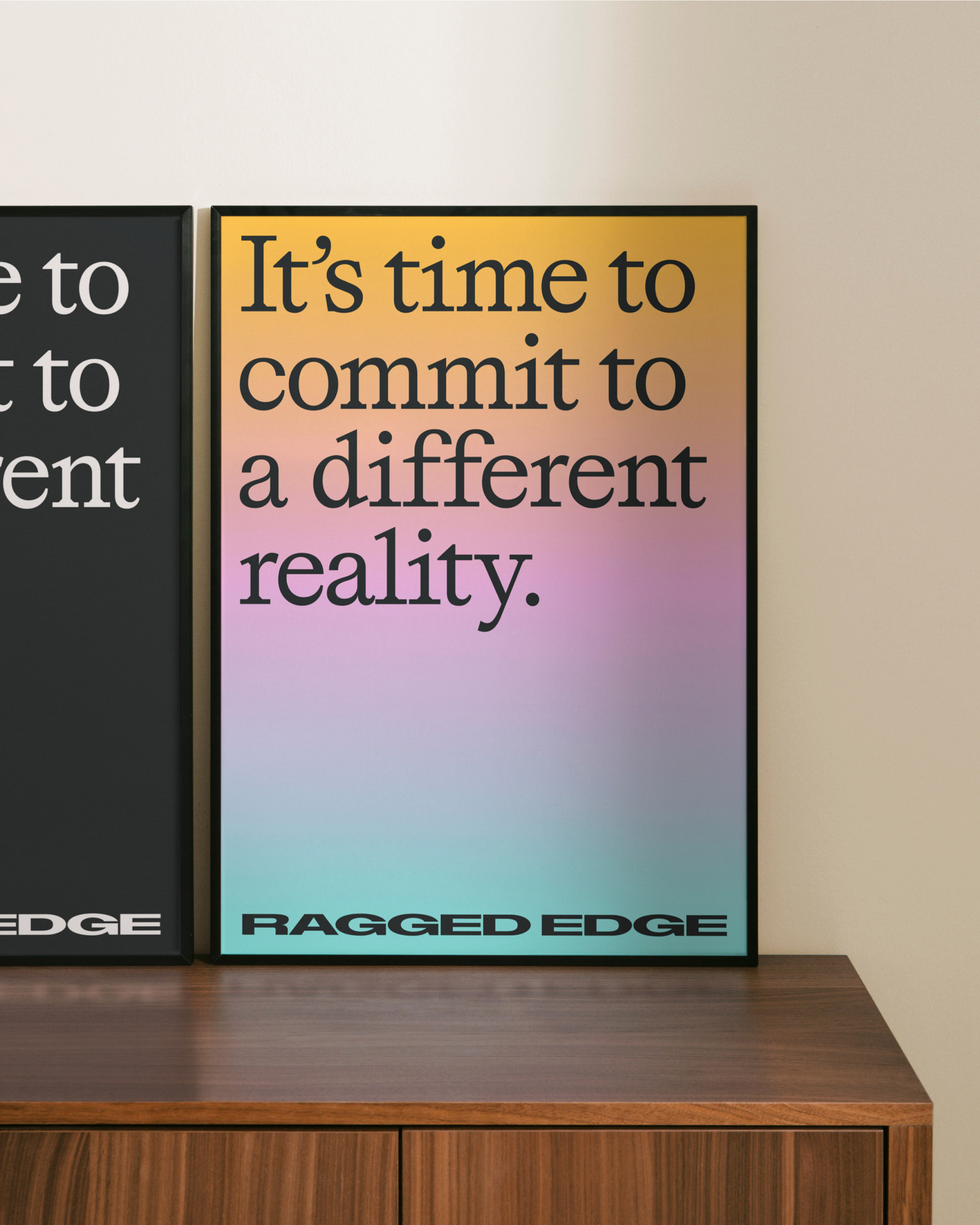
London-based brand design company Ragged Edge brought me in to create the design concept and set the direction for their new visual identity. To reflect their belief in transformation and their refusal to settle for average, we developed the idea of a perpetually shifting horizon. This visual and conceptual device became central to the system. It symbolises a precipice, a change of perspective, and a point of no return. A place where everything is possible and nothing stays the same.
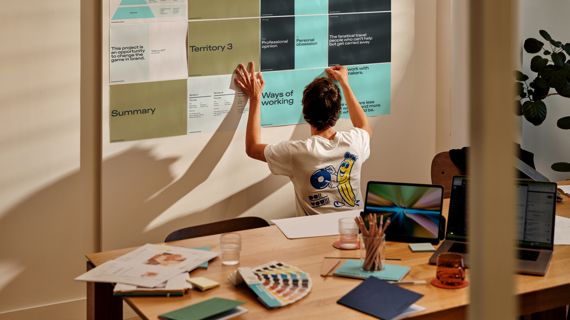
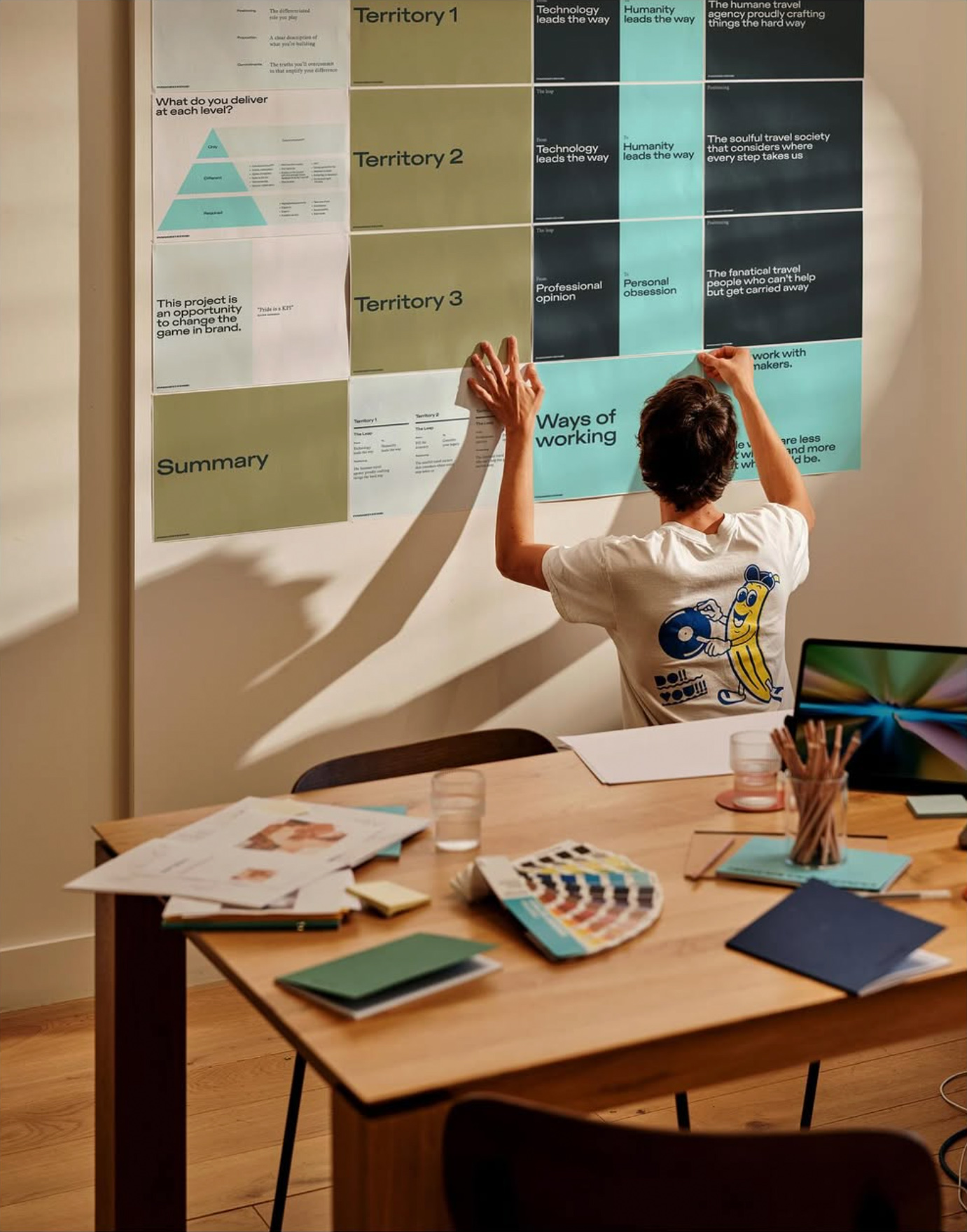
Working closely with their creative directors, I shaped the core concept and explored key elements of the system. This included early development of the wordmark, motion behaviors, typography, layout principles, color system, and tonal directions for 3D expression. The design system was later refined and expanded by Ragged Edge into a fully realized brand experience.
Working closely with their creative directors, I shaped the core concept and explored key elements of the system. This included early development of the wordmark, motion behaviors, typography, layout principles, color system, and tonal directions for 3D expression. The design system was later refined and expanded by Ragged Edge into a fully realized brand experience.
w/ Ragged Edge
2025
Credits